Tuesday, October 12, 2010

Happy Birthday Little Brother!

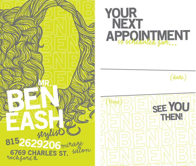
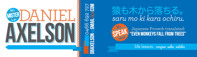
My younger brother turned 29 on Monday and has been asking for calling cards for awhile, so I thought what better time to design him something! He has many talents and things that make him unique, but I decided to focus in on his professionalism, his love of cooking and his Japanese background (he spent a few years after college in Japan).
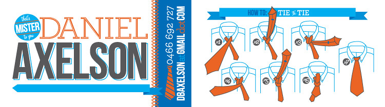
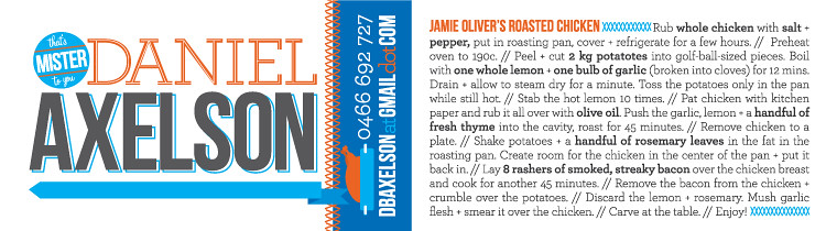
We're both very happy with the way things turned out! Each of the pictures below show the front and back of the cards—notice that the icon on the front changes to hint at what's on the back.
Dan's Cards
Dan's Cards
Dan's Cards

Monday, April 26, 2010

Ben's Cards

I love it when I get a client that lets me have a little fun with the work I do for them. Ben is that client—he's an incredibly talented hair stylist and a good friend. I wanted to give him something that was fun and friendly but still modern.
Business Cards

Sunday, April 11, 2010

Charming

It was so fun to see a locally-run website featured on one of my favorite design blogs, Design*Sponge. Wallblank offers a great selection of vintage and original prints and posters at great prices. I was honored to be asked to create something for the site a little over a year ago when they were first getting started. This is what I came up with.
Charming
You really ought to check out the site. I hadn't been in awhile and there's been some great additions! And the site itself is quite lovely.

Tuesday, April 6, 2010

A dangerous request

The junior high ministry is generally a challenge to design for. They often want juvenile without the wit, or just plain ol' nineties grunge. Ick. But I convinced the ministry leader to let me have a little fun with this Spring Retreat look. The weekend was called "Play with Fire" and my idea was to show these little monsters actually playing with fire. Fun huh? I thought so too. I particularly love the musical pair—his tambourine is hilarious!
Play with Fire
I think that the "Play with Fire" banner is really successful as well—it adds a nice sense of comic book sophistication and makes the illustrations a little more mature. The following is the cover of the retreat registration brochure and then the interior. The crossing lines help create a little more depth to the fairly 2-dimensional design.
Play with Fire
Play with Fire

Thursday, March 25, 2010

The Masculine Journey

It's always a bit of a struggle for me to create for men. Especially for mid-western "guys' guys"... Generally my style is more understated and lovely than the client really wants. However, there's been a new trend in men's design lately and I've been able to get away with the use of muted tones and scripts more than ever before. I created this look for the new session of Men's Fraternity at Heartland and it has yet to be approved but I thought it was worth sharing.
Men's Fraternity Presents

Sunday, March 14, 2010

Hire a Viking

I do graphic work for a gentleman who owns a business called "Norwegian Squeegee" (fun, huh?) and he recently asked me to illustrate a little viking pamphlet that he would leave behind for his clients after he finished a job. It was quite clever actually. He wanted it to give silly tips for keeping your windows clean, like keeping children and pets away from the windows and being sure to never let it rain or snow on your house. Since these things are unavoidable, you'll have to call Norwegian Squeegee again and have your windows cleaned. So the pamphlet had his contact information and was just an overall fun way to remember to call him again. Below is the cover of the pamphlet, a sample interior page and then the viking illustrations. I think he's adorable!
Viking Cover
Viking Interior
Viking Protector
Viking Dad

Heart To Heart

I was recently asked to design a logo for a not-for-profit organization based in California. This is how it turned out...
Heart to Heart

Wednesday, February 10, 2010

Devendra

Devendra Banhart's "Cripple Crow" has seen a lot of play on my itunes. Hiding in this quite lengthy album is a sweet little song called Canela (which apparently means cinnamon in Portuguese). The lyrics are quite lovely and remind me of old-school love letters—so poetic and endearing. So that's the inspiration for this valentine. I can just imagine Devendra penning this note to his sweetheart and sending a little bird to her windowsill.
canela

Tuesday, February 9, 2010

The Four Tops

It's a classic! So catchy and charming. Until you listen to the lyrics. Maybe it's the lack of a "valentine" per se, but I seem to be picking bittersweet love songs. But the pie is delightful, yes? Yes.
sugar-pie

Monday, February 8, 2010

Zooey + M. Ward

This valentine isn't particularly sweet, the lyrics are actually kind of sad. But the melody is nice and the overall "I love you and all I want you to do is just hold me" is quite lovely. If you aren't familiar with the sweet voice of Zooey Deschanel as paired with M. Ward, you better do yourself a favor and check out their collaboration (under the name "She and Him"). You'll fall in love.
a-hold-on-me

Saturday, February 6, 2010

The Kinks

I love music. I especially adore love songs. And since it happens to be that time of year, and since I don't have a whole lot worth posting about lately, I thought I'd challenge myself to a little project. Every day (fingers crossed) from now until Valentine's Day I'm going to create a little something that either has song lyrics in it or is a loose interpretation of a song. The first one is from The Kinks and is from the beautiful movie, The Darjeeling Limited. I drew it this afternoon and am quite pleased. Don't forget to listen to the song (Strangers). And don't forget to check out the Darjeeling! xoxo
darjeeling

Thursday, January 21, 2010

Amy + Lincoln

Amy and Lincoln were married at a charming old barn in a beautiful field in California. They asked for their invitations to be romantic and nostalgic so I chose a lovely ivory linen paper and a vintage pattern to line the envelopes.
amy+lincolnamy-+-lincoln-rsvp

You'll Look Sweet Upon The Seat...

I'm in the mood for a little pink and green what with all of the grey I'm surrounded by lately. Thought you might be in the mood too. Enjoy this early valentine from me to you (if I were Daisy and you were Michael).
bicycle-valentine

Wednesday, January 20, 2010

Vantage Point

I created this identity for a message series on the story of the Prodigal Son. The message was taught from the view (or "vantage point") of the prodigal, the other brother and the father in the story. The only restriction I had was to incorporate a fence (that was used as stage decoration for the duration of the series). I chose a hot air balloon because of your ability to see many different angles when you're inside of it (and also because I've always wanted to design something with a hot air balloon!). The textured background and colored circles were to add texture and a sense of whimsy. I think it was quite successful.
vantage-point

Thursday, January 7, 2010

Cold + Snow

I feel like I just took this picture! Look at that green grass! Boy do I miss it already. It's going to be a long winter. I created this shower invitation for a friend of my very good friend (and cousin). They had an amazing photographer take their engagement photos and it was great to be able to use them for this shower. What else do you do with engagement pictures anyway?
courtney

Sunday, January 3, 2010

Jason + Jess

Two of my all-time favorite people got married a couple of years ago (I can't believe it's already been that long!). Jess was such an amazing collaborator and it was her idea to do the photo corners. This invitation is so them and I was incredibly pleased with the outcome.
petersen-invite

Saturday, January 2, 2010

Seeing Green

This invitation was being sent all over the country and I had the idea to use embroidery floss to personalize it by tying a line from where they were coming from to Rockford, Illinois (where the event was happening). It was a lot of work and luckily I had help from the lovely ladies I work with, but I think it was worth it in the end.
monvee

Friday, January 1, 2010

Ladies Night Out

As a bridesmaid for Rachel, I had the privilege of helping throw her bachelorette party. A few of the ladies and I went in to the windy city for an afternoon of music and an evening of dancing and fun. I wanted to create elegant and sassy invites - they're the perfect representation of the bride-to-be.
PrintPrint

Rachel + Jeff

This past summer a couple of my friends got married in a lovely outdoor ceremony. I was honored to create their wedding stationery.
bergstrom-card