Monday, April 26, 2010
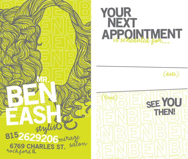
Ben's Cards
I love it when I get a client that lets me have a little fun with the work I do for them. Ben is that client—he's an incredibly talented hair stylist and a good friend. I wanted to give him something that was fun and friendly but still modern.


Sunday, April 11, 2010
Charming
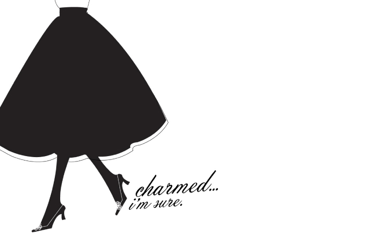
It was so fun to see a locally-run website featured on one of my favorite design blogs, Design*Sponge. Wallblank offers a great selection of vintage and original prints and posters at great prices. I was honored to be asked to create something for the site a little over a year ago when they were first getting started. This is what I came up with.
You really ought to check out the site. I hadn't been in awhile and there's been some great additions! And the site itself is quite lovely.

You really ought to check out the site. I hadn't been in awhile and there's been some great additions! And the site itself is quite lovely.
Tuesday, April 6, 2010
A dangerous request
The junior high ministry is generally a challenge to design for. They often want juvenile without the wit, or just plain ol' nineties grunge. Ick. But I convinced the ministry leader to let me have a little fun with this Spring Retreat look. The weekend was called "Play with Fire" and my idea was to show these little monsters actually playing with fire. Fun huh? I thought so too. I particularly love the musical pair—his tambourine is hilarious!
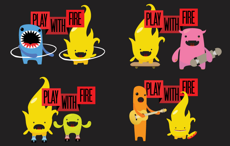
I think that the "Play with Fire" banner is really successful as well—it adds a nice sense of comic book sophistication and makes the illustrations a little more mature. The following is the cover of the retreat registration brochure and then the interior. The crossing lines help create a little more depth to the fairly 2-dimensional design.

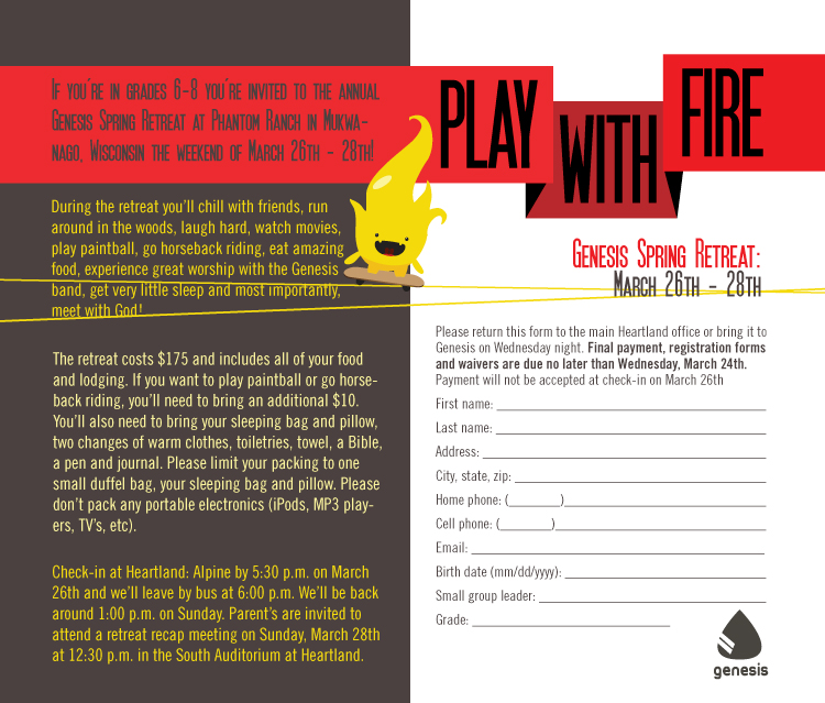

I think that the "Play with Fire" banner is really successful as well—it adds a nice sense of comic book sophistication and makes the illustrations a little more mature. The following is the cover of the retreat registration brochure and then the interior. The crossing lines help create a little more depth to the fairly 2-dimensional design.


Subscribe to:
Comments (Atom)


