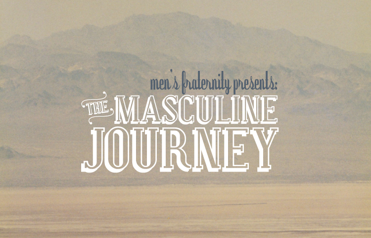
It's always a bit of a struggle for me to create for men. Especially for mid-western "guys' guys"... Generally my style is more understated and lovely than the client really wants. However, there's been a new trend in men's design lately and I've been able to get away with the use of muted tones and scripts more than ever before. I created this look for the new session of Men's Fraternity at Heartland and it has yet to be approved but I thought it was worth sharing.
Thursday, March 25, 2010
Sunday, March 14, 2010
Hire a Viking
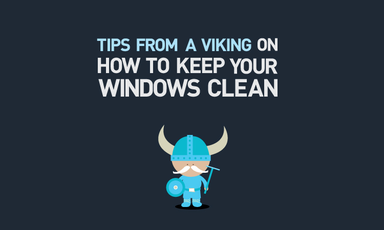
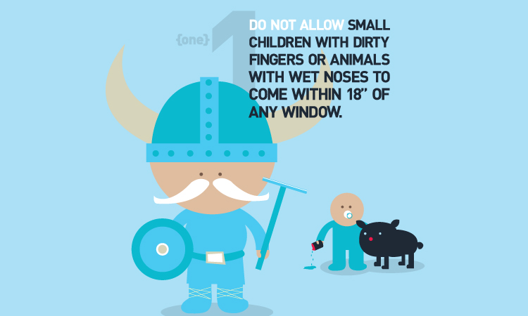
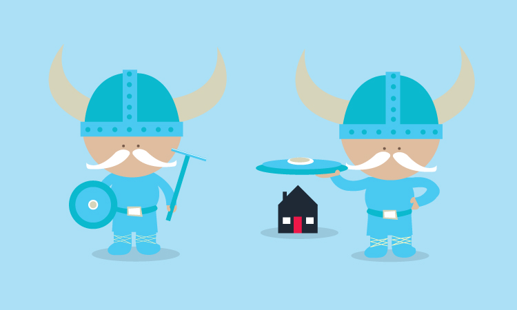
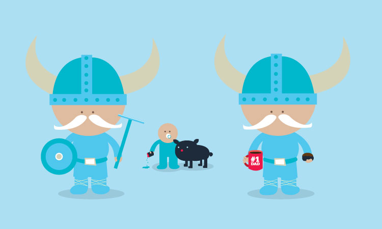
I do graphic work for a gentleman who owns a business called "Norwegian Squeegee" (fun, huh?) and he recently asked me to illustrate a little viking pamphlet that he would leave behind for his clients after he finished a job. It was quite clever actually. He wanted it to give silly tips for keeping your windows clean, like keeping children and pets away from the windows and being sure to never let it rain or snow on your house. Since these things are unavoidable, you'll have to call Norwegian Squeegee again and have your windows cleaned. So the pamphlet had his contact information and was just an overall fun way to remember to call him again. Below is the cover of the pamphlet, a sample interior page and then the viking illustrations. I think he's adorable!
Heart To Heart
Subscribe to:
Posts (Atom)